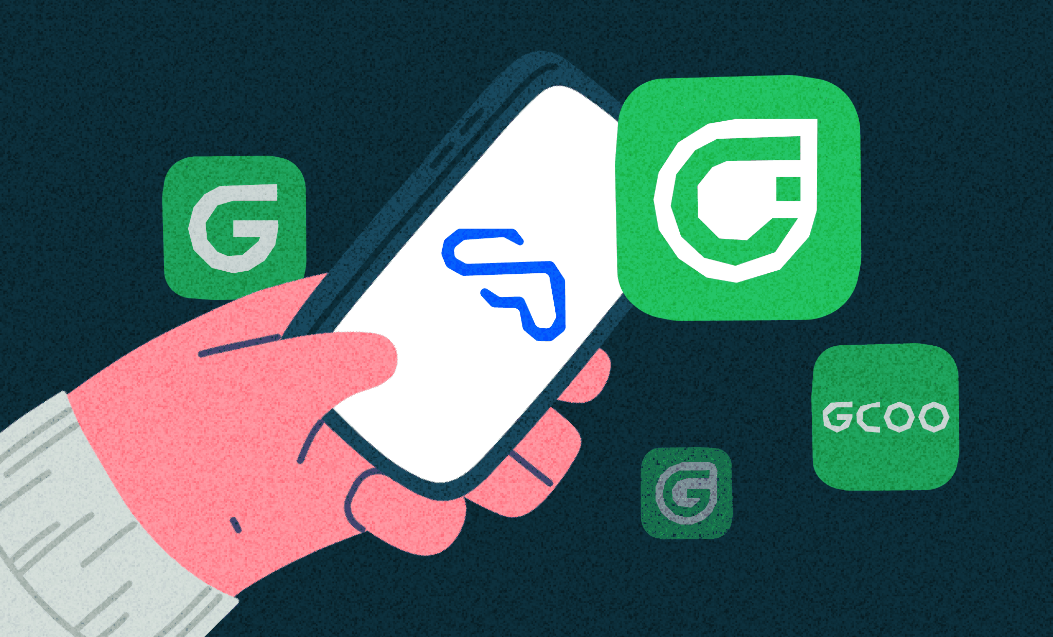
Hello, I am Leah, the head of the UX/UI part at GCOO Design Headquarters.
In the rapidly changing IT market, app icons are one of the key factors influencing the influx of new users. We often conduct AB tests focusing on increasing store conversion rates.
GCOO uses a symbol logo in its app icon, and since this symbol logo was not frequently used in the app, we could not determine how much it influenced users. So, we decided to first test some designs with existing users. We needed to ensure that existing users would not face branding confusion or have difficulty finding the app if its icon changed.
Now, let me introduce the simple user test conducted at GCOO using app icons.
Selecting UT Tool
We selected Maze (https://maze.co), a tool we’ve used before, for the UT.
The advantage of Maze is that it allows designers to easily design UTs using basic templates. You can also connect Figma prototypes to analyze heatmaps and videos. Additionally, you can use the global tester pool registered on Maze without recruiting testers separately.

Test Design
To see accurate test results, you need to elicit natural user behavior. Therefore, we conducted the test by simulating the situation where existing users open the app on the road to ride GCOO.
Test Guide & Pre-questions
Users can start the test through an app banner. At this time, they are directed to different links depending on the type of device, to show different screens based on the user device in the following tests. We minimized pre-question items to allow quick test entry.
1st Test: Design Tournament
The first and second tests each feature a total of four designs.
In the first test, we aimed to see if the morphological characteristics of the designs influenced user choices. We paired the designs and asked which form was more recognizable as the GCOO app.

2nd Test: Imagining Real Situations
The second test assumed a situation where users encounter GCOO while walking and attempt to rent. We randomly placed the GCOO app on the screen and asked users to continuously find it. In the first test, users chose the app icon directly by seeing it, while in the second test, we aimed to measure the actual recognition time.
Conclusion

By combining the first and second tests, the result was the victory of the existing app icon as a control group. We found that the symbol was recognized well by users more than expected. Therefore, GCOO still maintains the app icon with the symbol.
If GCOO changes the app icon in the future, you will consider it a change with a reason, right?😎
Look forward to GCOO's design with meaningful updates in the future!
Thank you.
Written by Leah(리아)

Leah | UXUI Part Lead
Designing comfort.


